
Refreshing greenlight bookstore’s online Identity to better connect and serve local readers
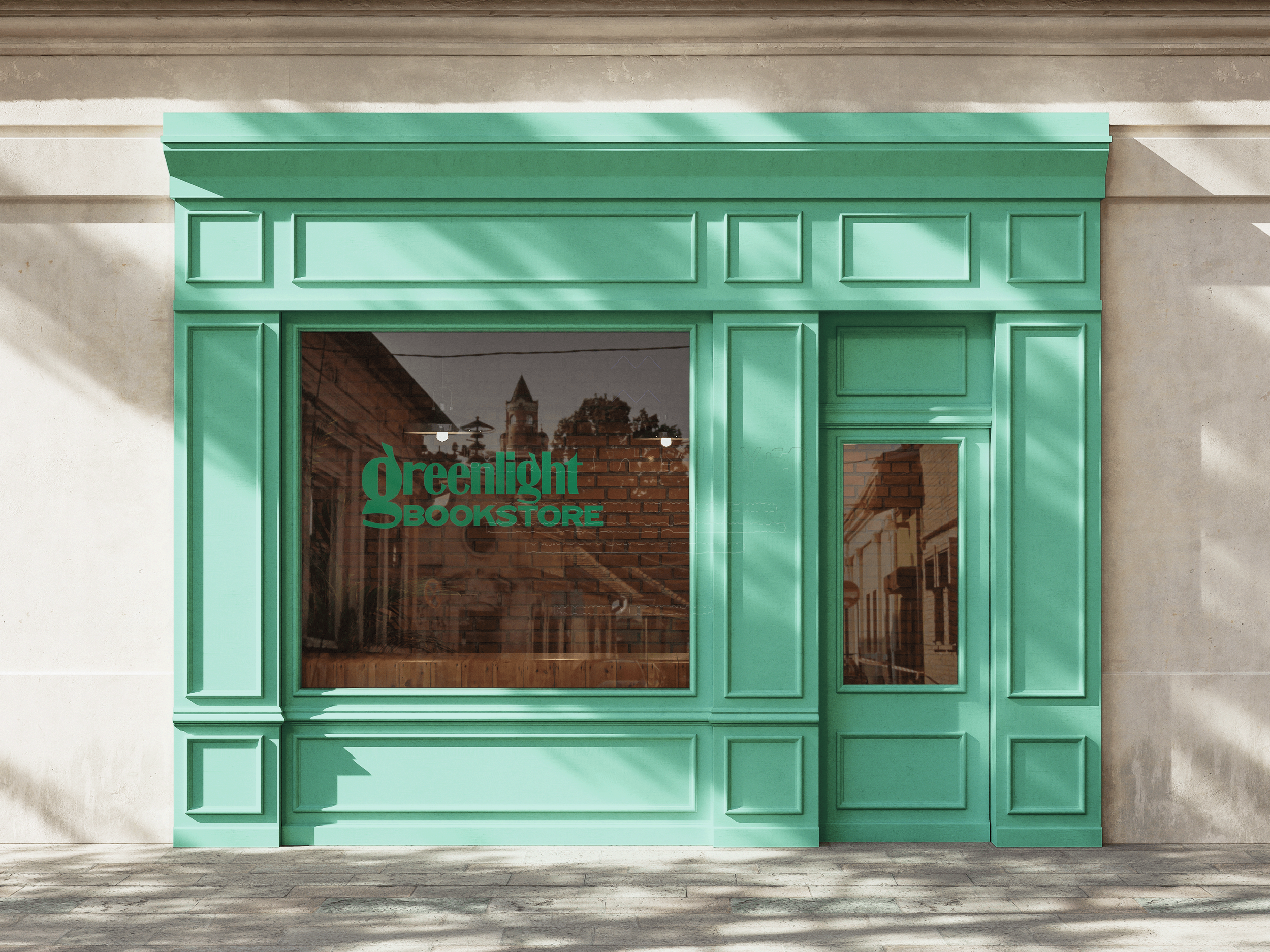
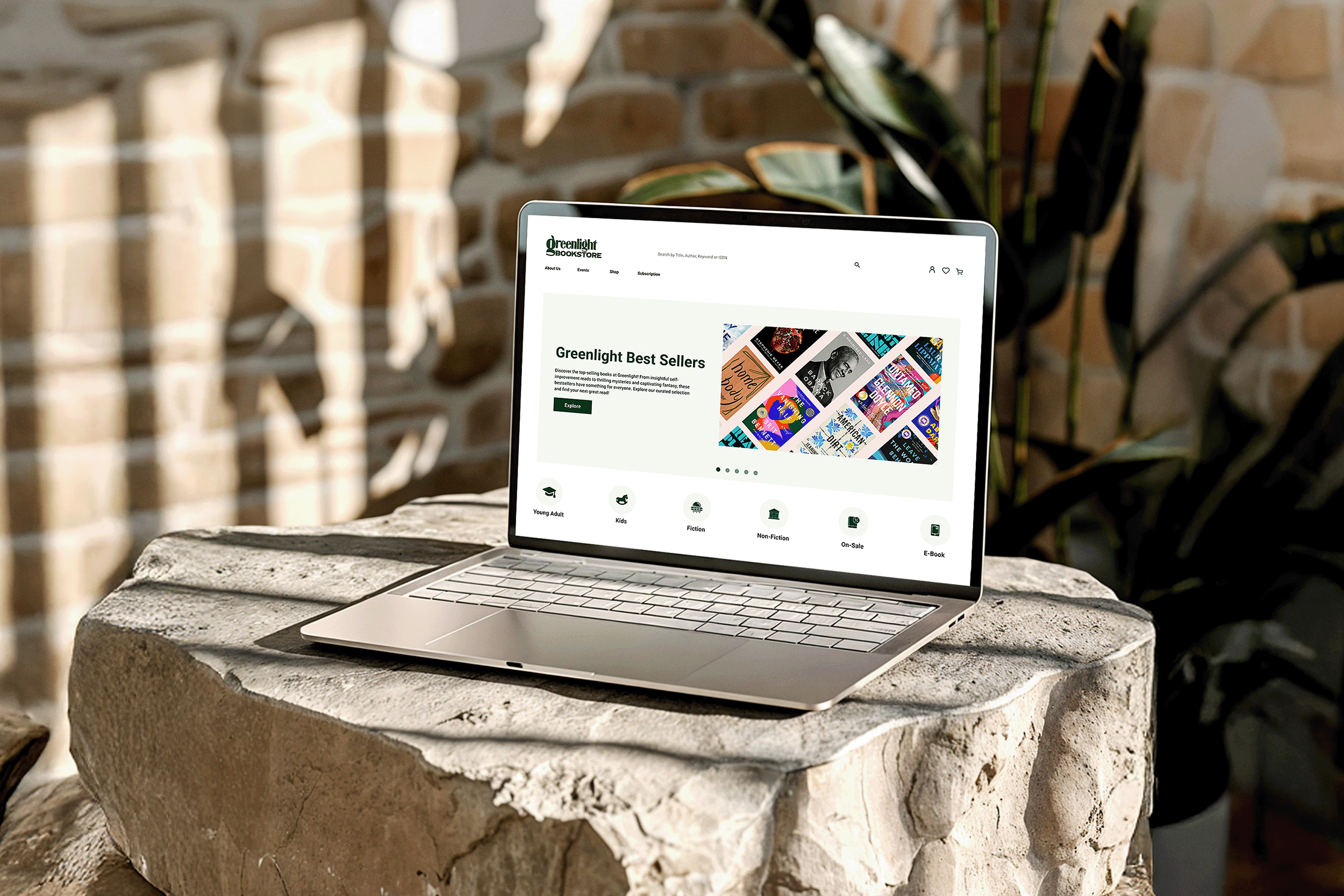
Greenlight Bookstore is a beloved Brooklyn literary hub known for its community-centered events and curated selection. Our redesign project aimed to refresh its online identity and create a more intuitive, mobile-responsive experience that better reflects the warmth and vibrancy of the physical store.
By modernizing the site’s structure, updating its visual design, and improving navigation, we sought to help Greenlight more effectively serve both local readers and an expanding online audience.
My Role
Timeline
Product Designer
15 Weeks
Contributions
Product Design
User Interviews
Prototyping
Competitor Analysis Interaction Design Branding
Impact
35%
Decrease in task completion time, reflecting faster navigation and overall smoother user experience.
2X
Increase in monthly online revenue, underscoring the effectiveness of the improved experience.
45%
Drop in customer support queries, indicating an intuitive design and improved user understanding.
57%
Uplift in user satisfaction, measured through survey tools, showcasing the effectiveness of streamlined navigation.
The Challenge
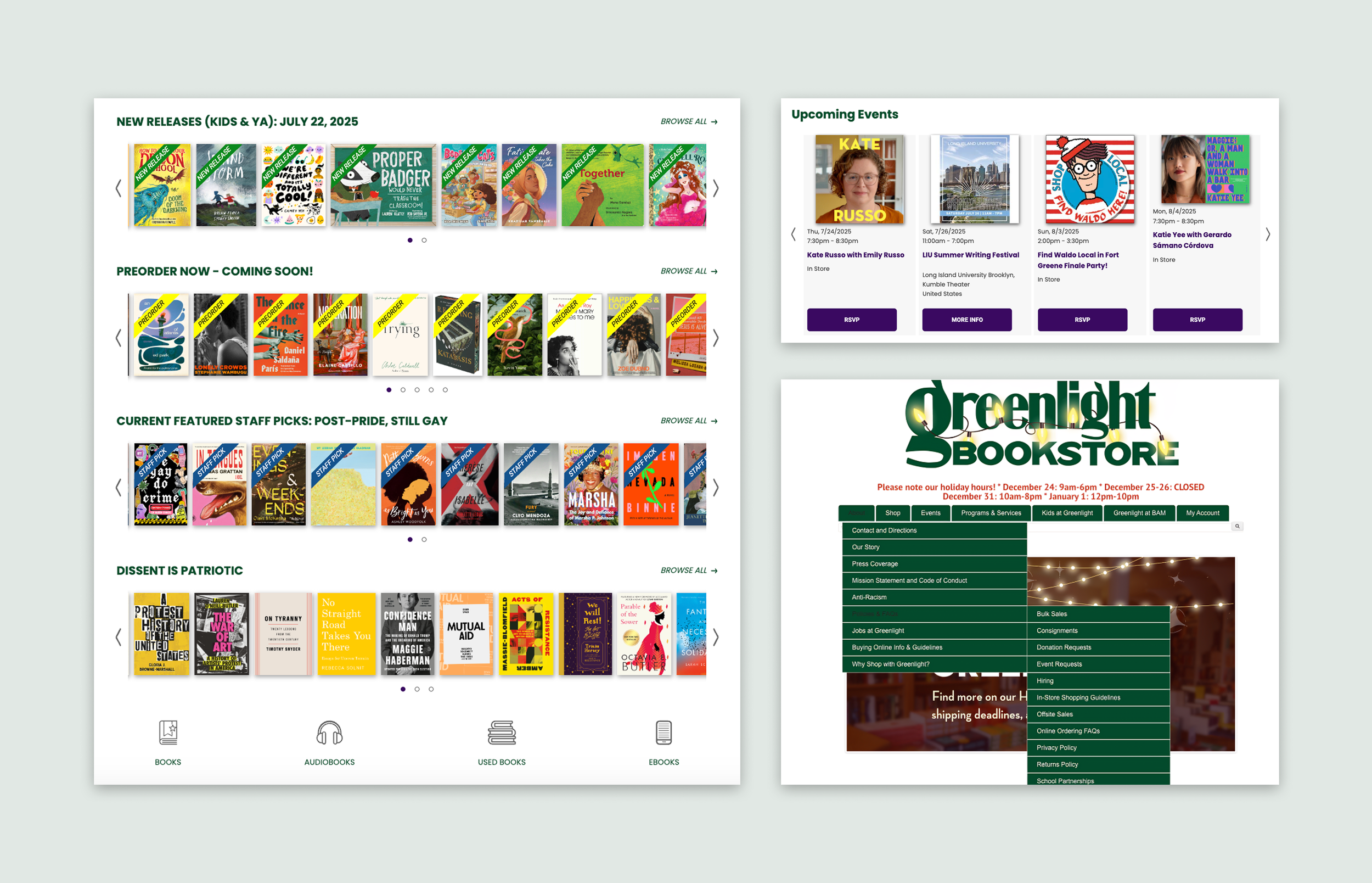
As Greenlight Bookstore’s online presence expanded, the website struggled to keep pace. Its growing content became increasingly cluttered, and outdated interaction patterns made it difficult for users to navigate or find what they needed.
Without a clear, scalable strategy for organizing information, the site no longer reflected Greenlight’s commitment to delivering a high-quality customer experience and supporting the growth of its online sales.
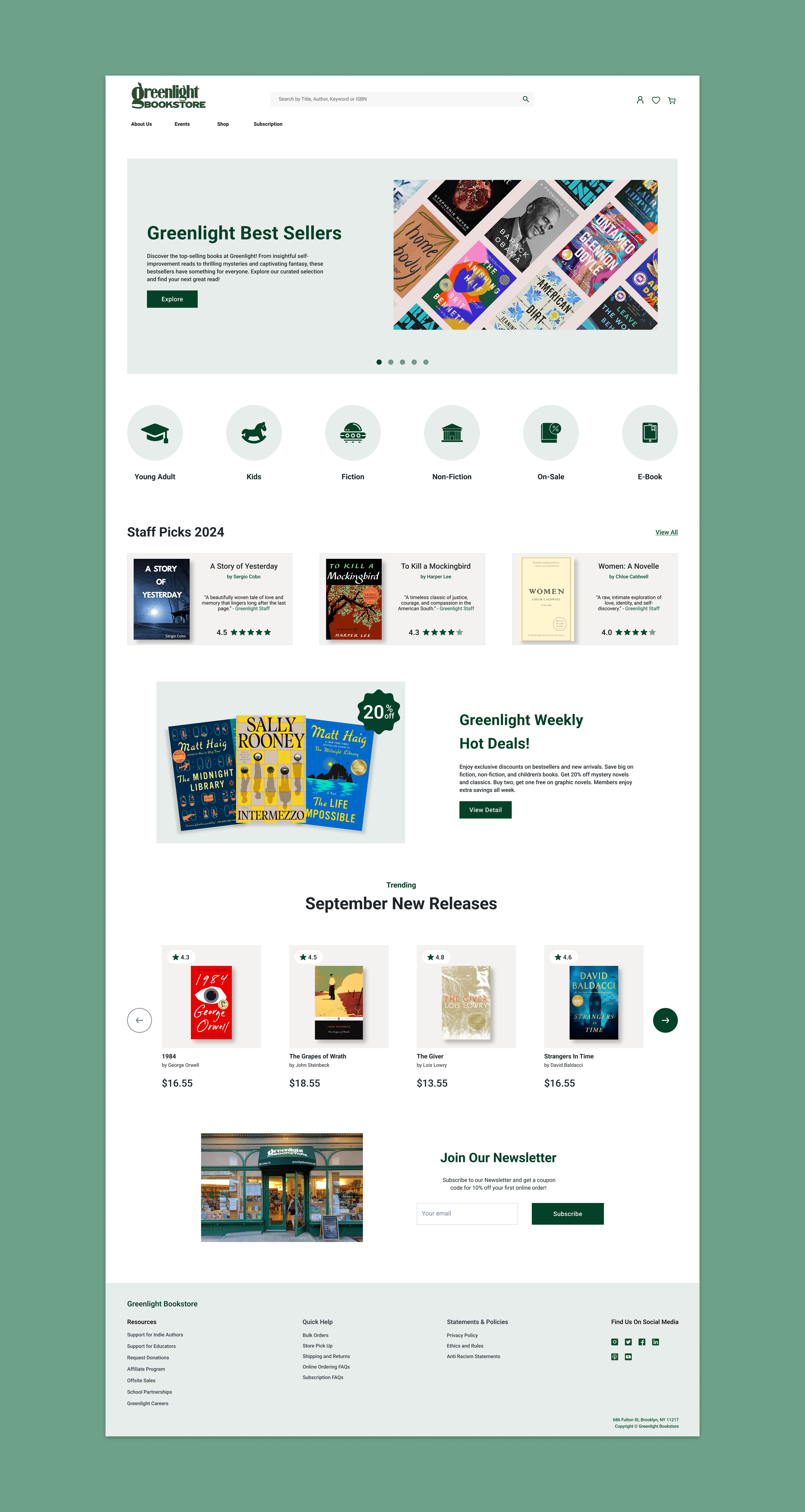
Introducing a modern visual system and intuitive navigation to create a seamless, best-in-class online bookstore experience.
Our Design Solution

Identify the roadblocks
Cluttered Navigation and Low Engagement
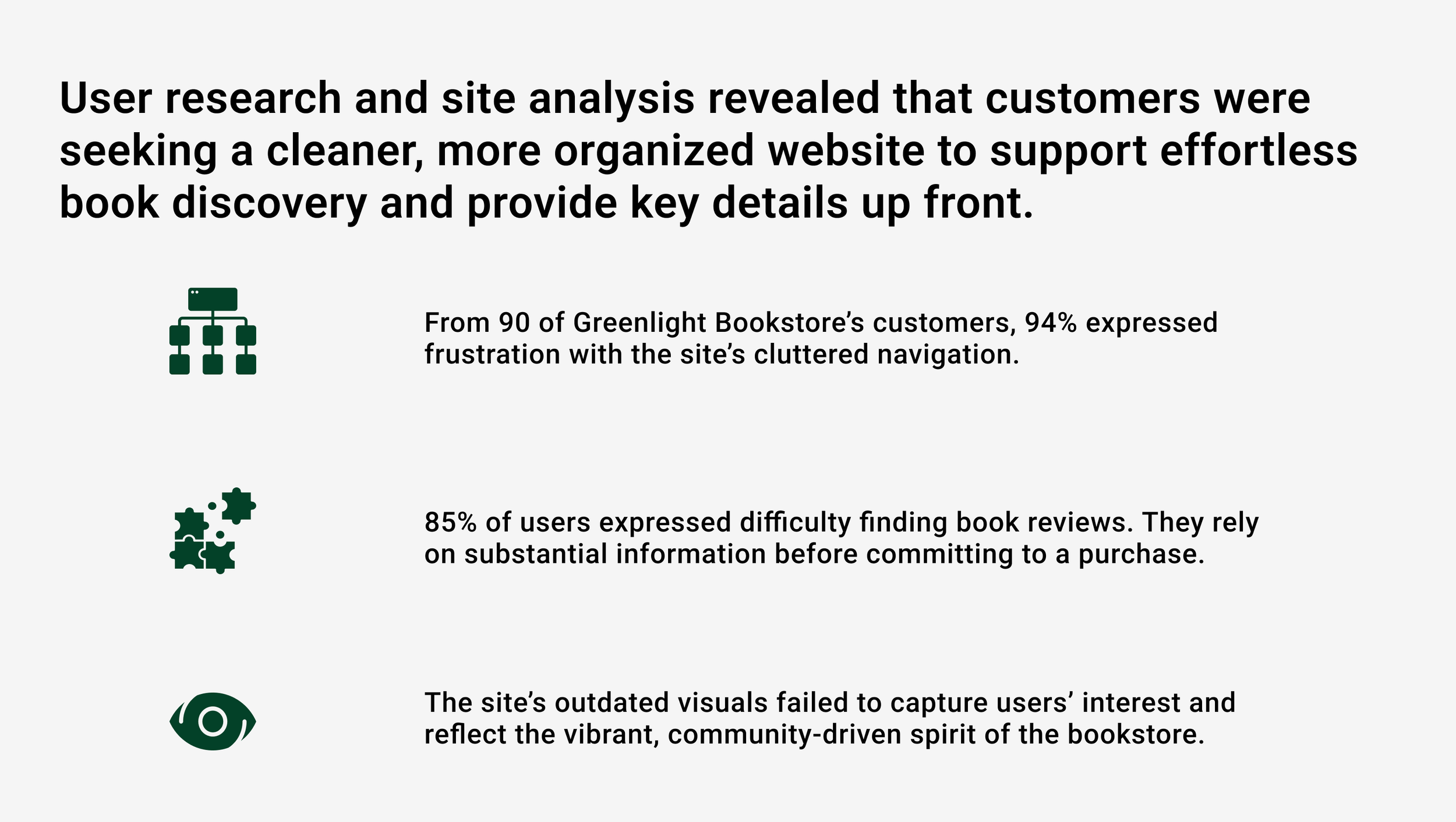
Tackling these obstacles was essential to delivering a more enjoyable and smooth user experience.
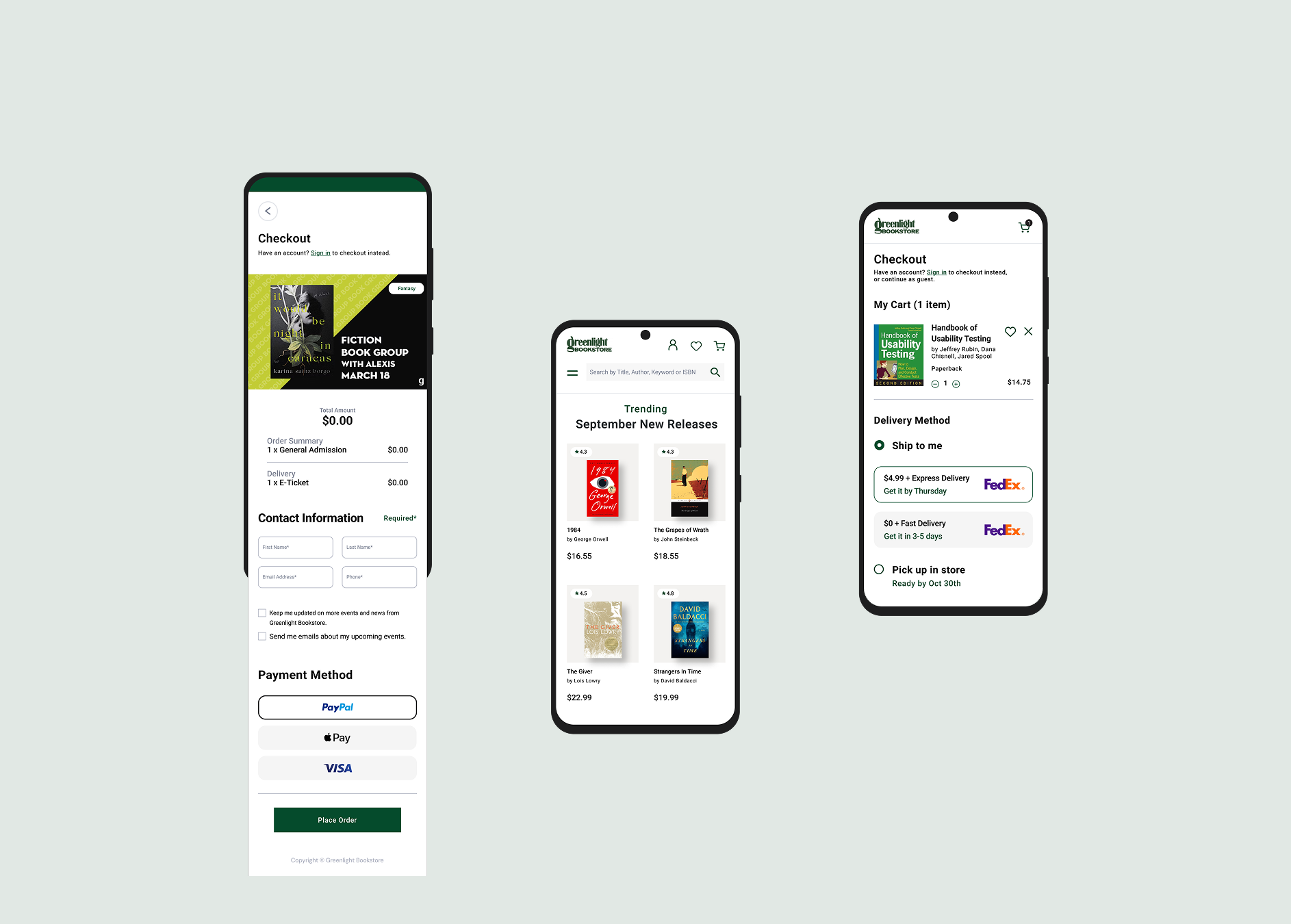
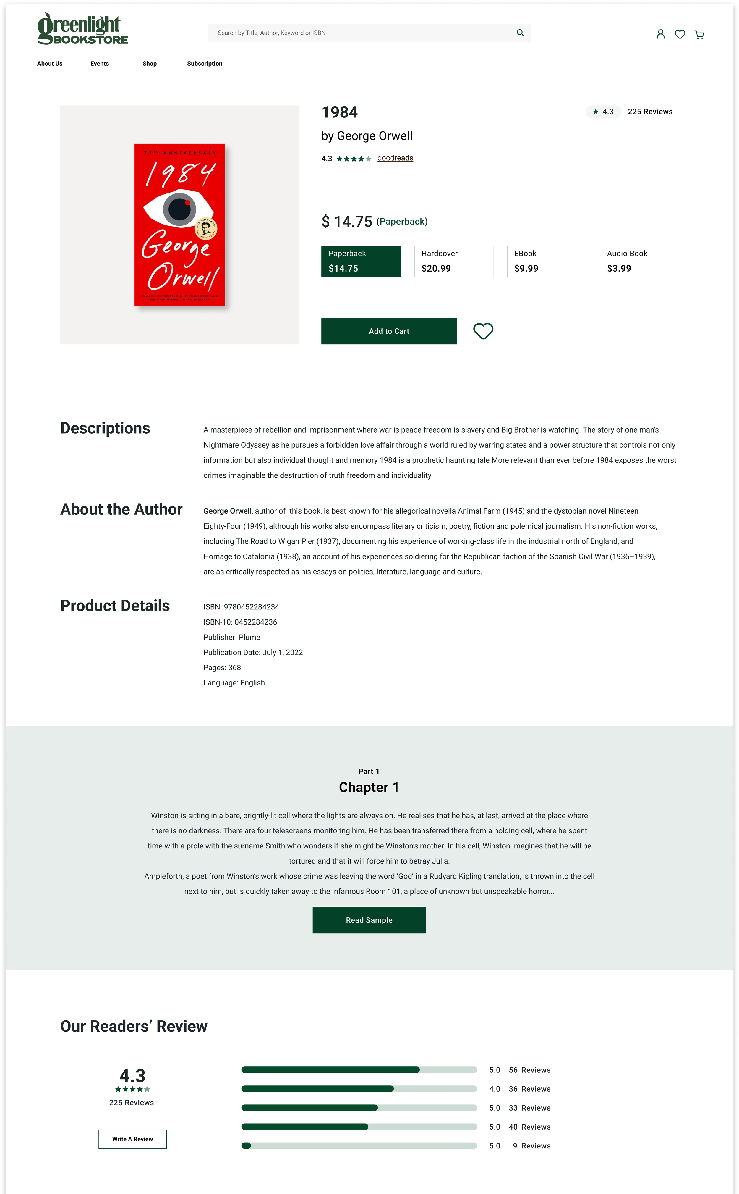
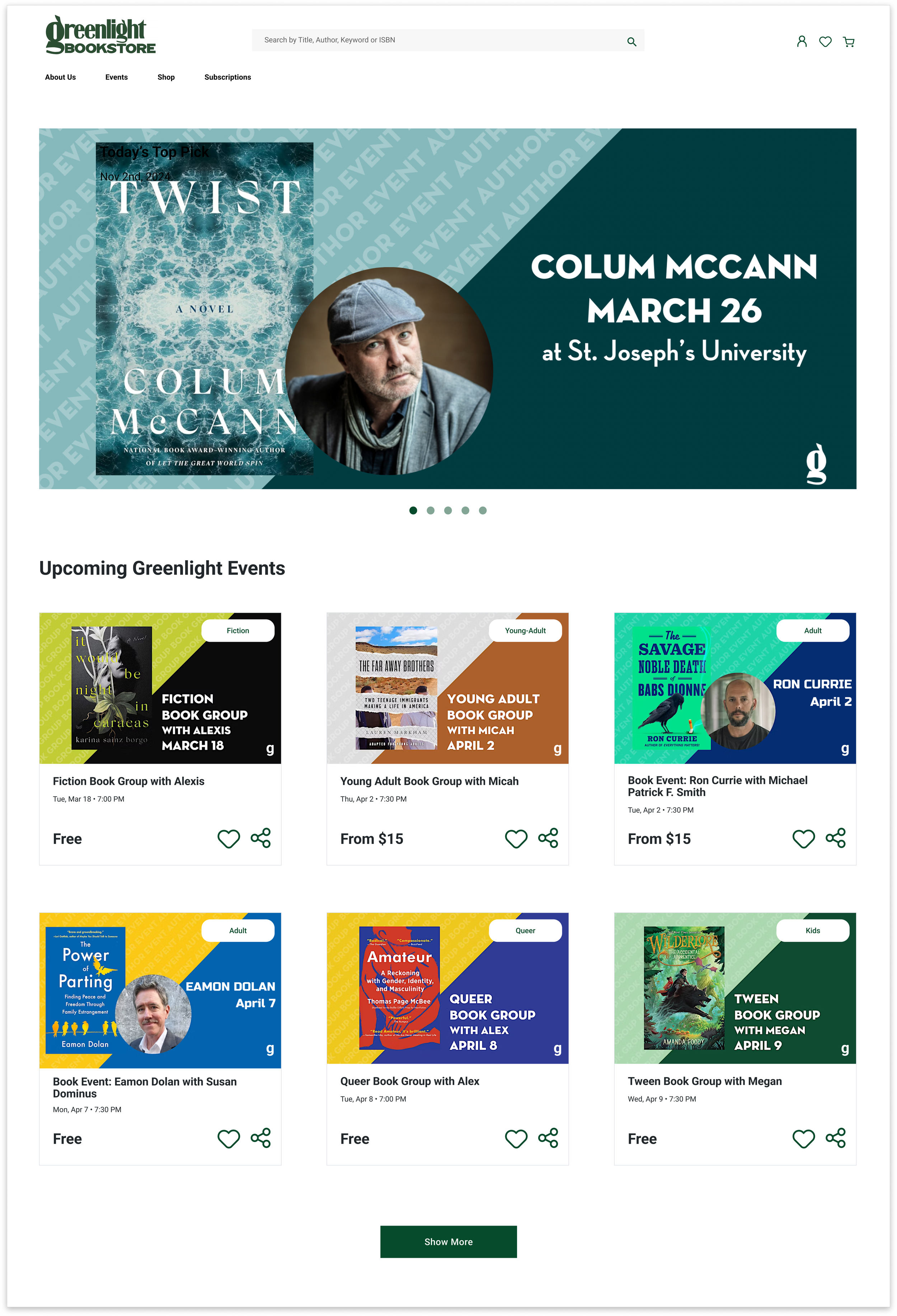
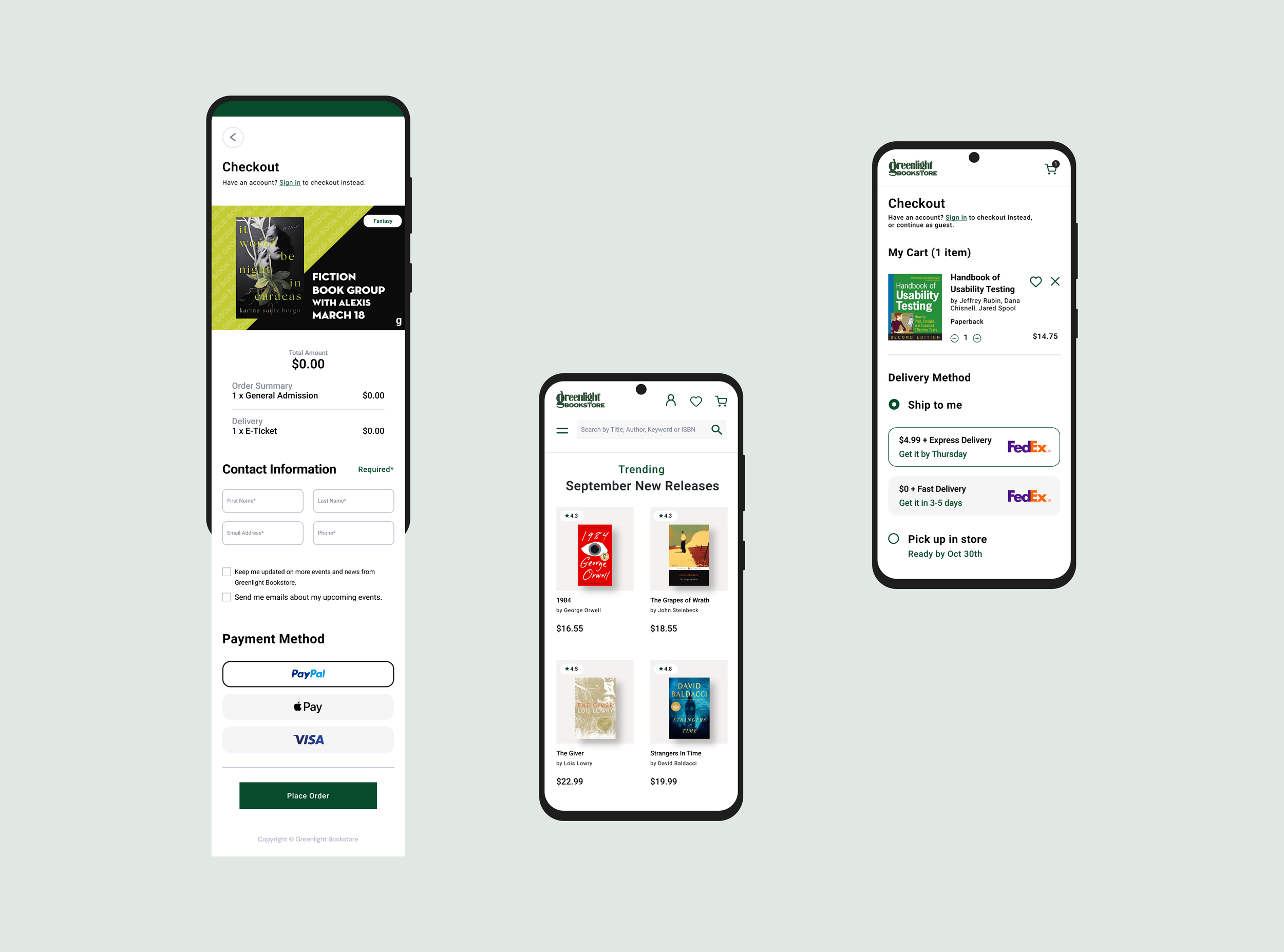
I led the end-to-end redesign by streamlining navigation, improving content structure, and refreshing the visual design to simplify book and event discovery, better understand user preferences and motivations, and encourage repeat visits across all devices.
Our Strategy
Clarifying complexity through structure and visual design
Greenlight’s growing content and community offerings called for a more strategic, user-centered approach to digital design. To meet this need, we focused on simplifying the experience, making it easier for users to find what they need while reflecting Greenlight bookstore’s unique identity.
We prioritized three key principles: improving navigation, enhancing content hierarchy, and modernizing visual design. For each area, we mapped core user flows, defined content requirements, and created high-fidelity prototypes to test with users and guide implementation.


Takeaways
Leading the Greenlight Bookstore website redesign was both challenging and rewarding. By introducing intuitive navigation and optimizing mobile use, I helped create an online experience as welcoming and engaging as the physical store.
These efforts boosted revenue and user satisfaction, demonstrating the value of a more intuitive and enjoyable digital experience. Navigating diverse user needs while preserving the bookstore’s community-driven identity made this project an inspiring journey of creativity and growth in designing for both community and commerce.