


A design system built for Lovable to scale at speed
Kärlek is the first comprehensive design system for Lovable. It provides a unified visual language, reusable components, and clear interaction and usage guidelines to help the Lovable team design and build faster, more confidently, and with consistent brand quality.
With clear structure and guidelines, Kärlek enables teams to work more efficiently while creating cohesive, accessible, and delightful experiences across every products.
My Role
Timeline
Contributions
Product Designer
15 Weeks
Design System Content Auditing
UI Components System Branding
Documentation
My Role
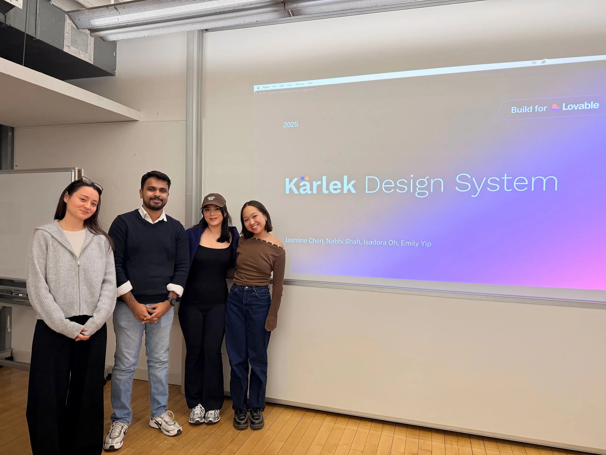
As lead strategy designer, I guided the team from ambiguity to direction. We explored multiple companies to find where a design system could have the greatest impact, ultimately choosing Lovable, a young company without an existing system, as the focus for our design system class, to create a foundational system that could scale with the company’s growth.
To ensure the system addressed Lovable’s goals, I facilitated team collaboration and strategic decision-making. In pitching Kärlek, our design system for Lovable, I led the narrative, framing the problem, defining key selling points, and connecting our design decisions into a cohesive story that clearly demonstrated the system’s value.
The Scaling Need
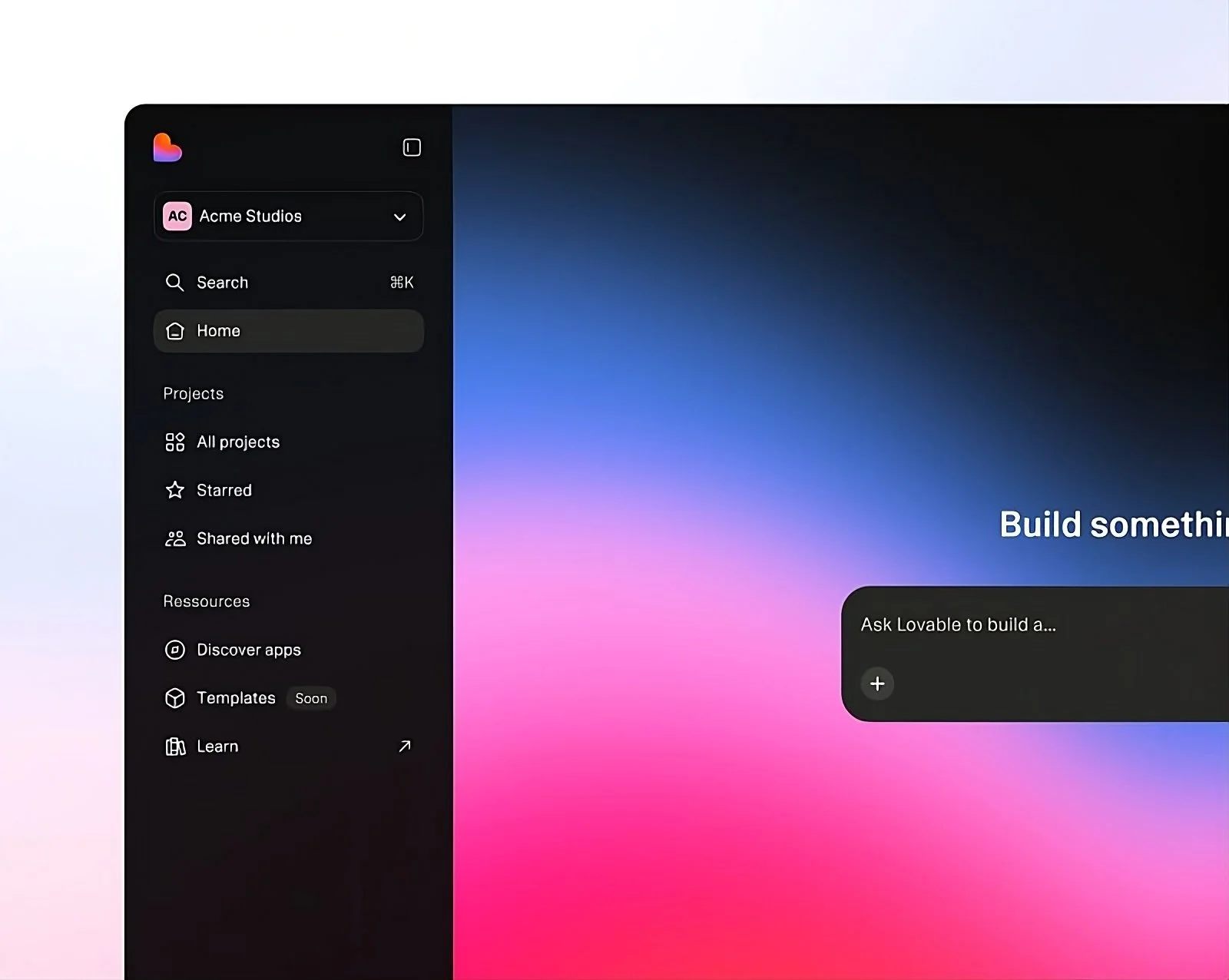
Lovable is one of the fastest-growing AI startups in the world, focused on making software engineering accessible to everyone. It allows anyone to build apps and websites simply by chatting with AI.
As the product expanded, inconsistent components, styling, and fragmented patterns began to slow teams and dilute the brand experience, highlighting the need for a unified design system.
Lovable needs structure to scale at speed.
Introducing Kärlek Design System
A unified, scalable design system that brings consistency and clarity to every part of the Lovable product.
The system includes a robust library of reusable components, a structured Figma kit, an organized token system, and a clear, easy-to-follow documentation.
Kärlek helps Lovable build fast faster .
Discover
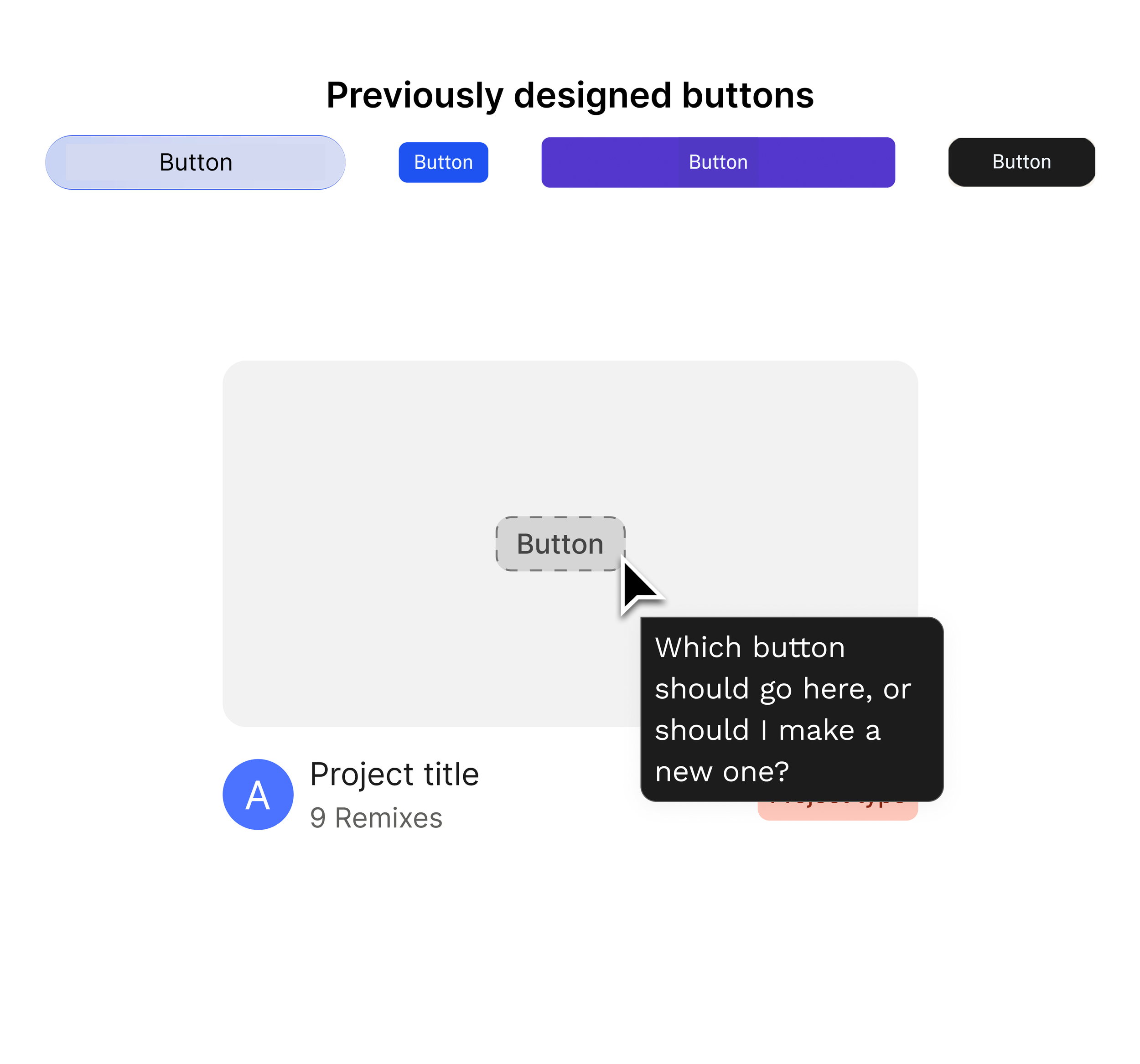
To build a cohesive design system, We first deconstructed the Lovable website, capturing and categorizing all UI components in Figma.
Components were organized into categories such as colors, buttons, inputs, typography, and imagery. This process allowed us to analyze the interface and identify several key issues within the current website.
Deconstructing for design clarity
3 Major Problems We Uncovered
Problem 1
Lack of usage guidelines leads to confusion. Designers waste time choosing components, and developers rebuild what could be reused.
Manual Workflow

Problem 2
Different styles across inputs, buttons, and form elements caused the interface to feel uneven and unpolished. As the product grew, these inconsistencies made the experience feel less cohesive and weakened the overall brand.
Fragmented Components
Problem 3
The current site used unstructured colors across light and dark modes, resulting in visual inconsistency and a weakened brand identity.
Inconsistent Color Palette
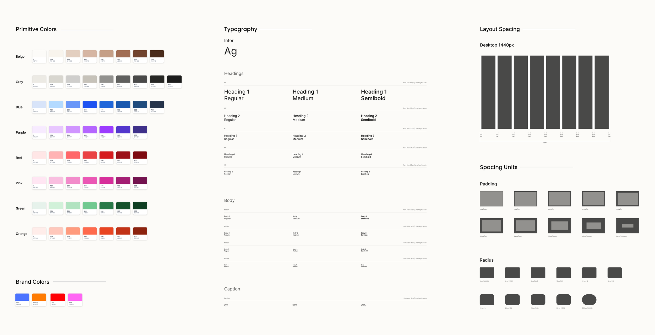
Foundations
To ensure consistency and scalability across Lovable’s products, I led the team to develop a set of design tokens defining core style elements such as colors, typography, spacing, and elevation.
These tokens act as a single source of truth, enabling components to adapt seamlessly across screens and platforms while maintaining a cohesive and recognizable brand identity.
Creating tokens to enable scalable designs

A simple 2 level token structure, that promotes flexibility
What Kärlek Enables
Colors are automatically defined to transition across modes, ensuring visual consistency and making designing for modes faster and more efficient.
Built-in support for light & dark modes
Adaptive components supporting light and dark modes
When Lovable launches a new product or feature, the team no longer starts from zero. They can pull from governed Kärlek components, ensuring every new experience ships fully on-brand and high quality from Day 1.
Ready-to-use templates built with pre-set components
Template designed for workspace
While reviewing Lovable’s various menu types, I chose not to force a single standardized pattern, as each menu served a distinct purpose.
To preserve usability while maintaining a cohesive design, I developed multiple menu patterns that balance consistency with contextual flexibility.
Balance between standardization and flexibility
Menus designed for different purposes
Design
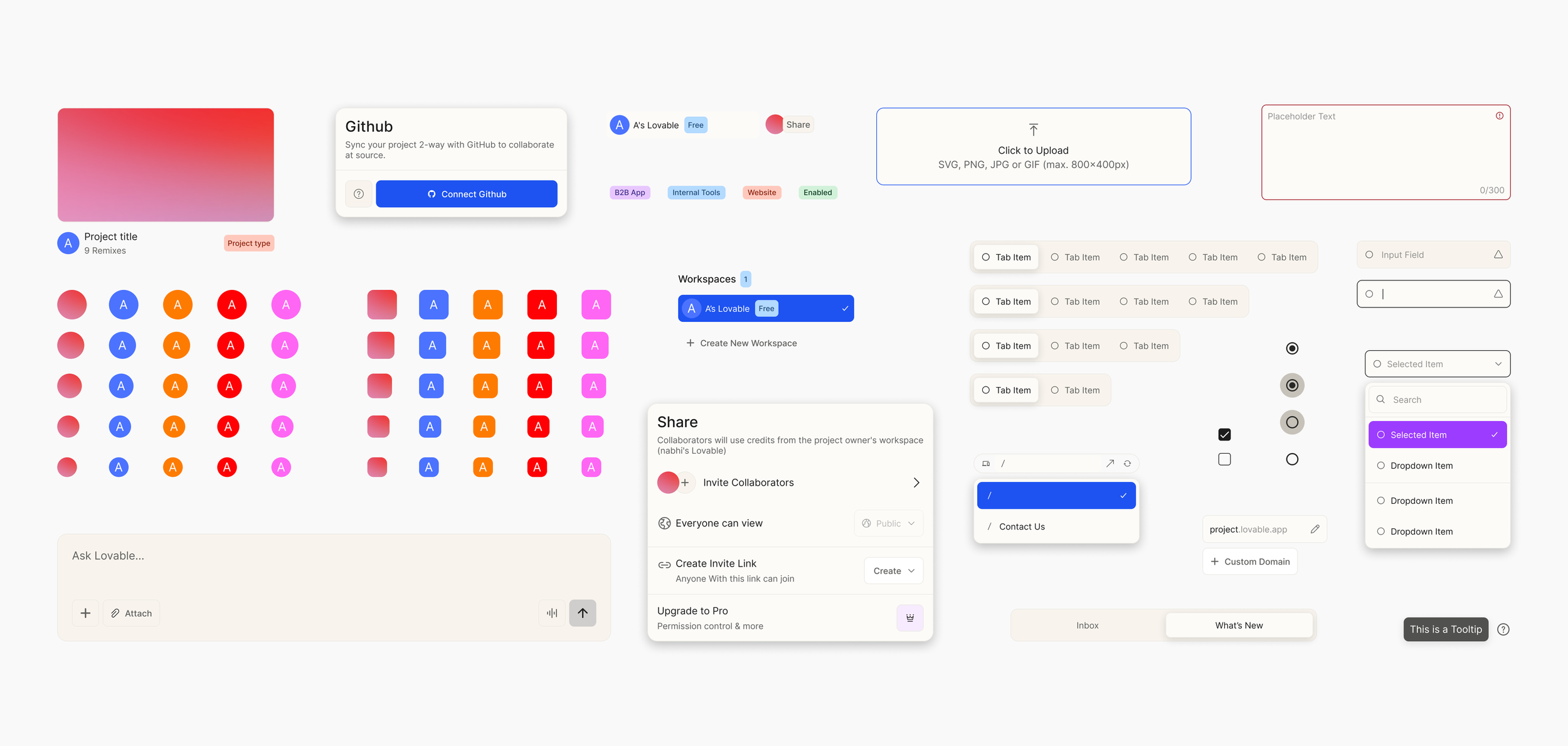
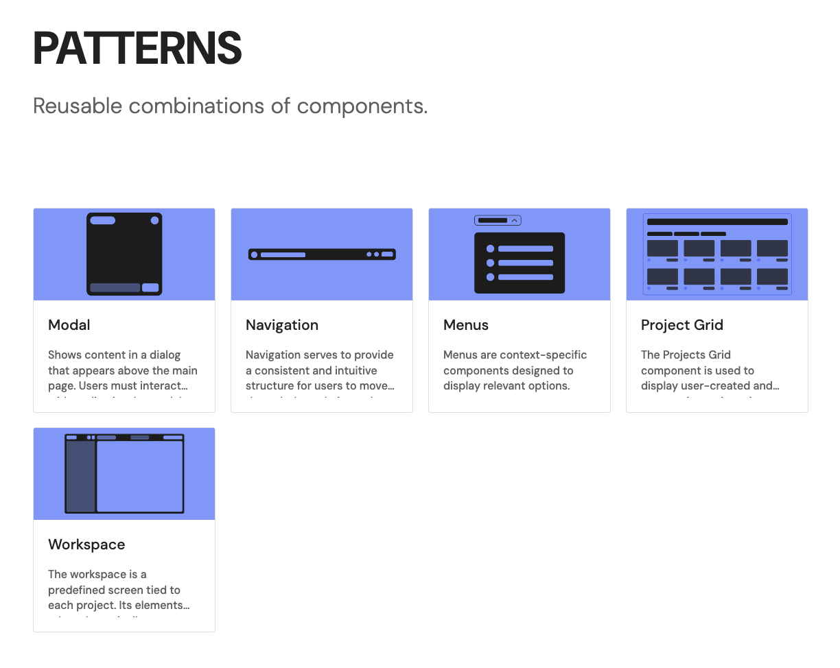
Building on the established foundations, I guided my team in creating a library of reusable components designed for consistency, flexibility, and responsiveness.
By defining these components from the ground up, we created a scalable UI kit that would enable the Lovable team to design and build efficiently across every product.
Designing consistent and scalable components
Design Faster. Ship Better. Powered by Kärlek
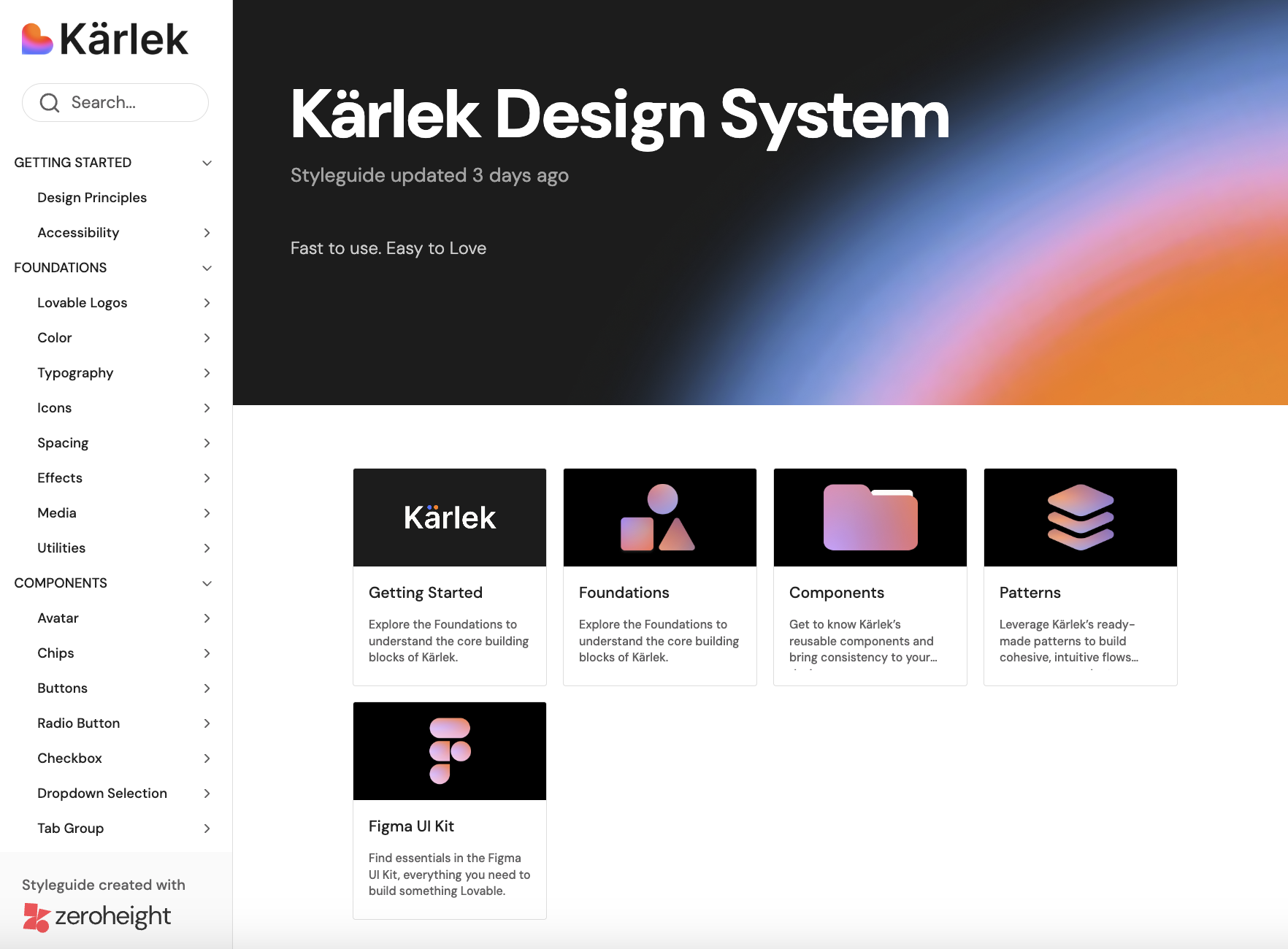
Documentation
We hosted Kärlek on Zeroheight to create a single source of truth. It brings together design principles, accessibility standards, components, and usage guidelines in one place, turning a collection of components into a scalable design practice.
This ensures teams stay aligned and allows changes to be implemented smoothly across products.
Structured guidelines for consistent and scalable design


Find out more about the Kärlek design system on Zeroheight and Figma Community.
Takeaways
During the tokenizing stage, I encouraged the team to slow down and refine our token system, ensuring we got the basics right. This careful approach aligned everyone, prevented issues later, and ultimately sped up the design process.
Slowing down to speed up
Designing for cohesion at scale
A design system is more than components, it’s a cultural change. Throughout this project, I learned how to balance stakeholder needs while creating a cohesive system across different product areas, ensuring consistency, usability, and scalability.